Notebook 012 - The Dashboard Is the Decision Surface
A dashboard can lie without showing anything false. That sounds dramatic, but the lie is usually subtle. The prices can be right. The account values can be right. The status badges can be right. The tables can refresh, the colors can move, and the system can feel alive. And still, the dashboard may not be answering the question the desk actually needs answered.
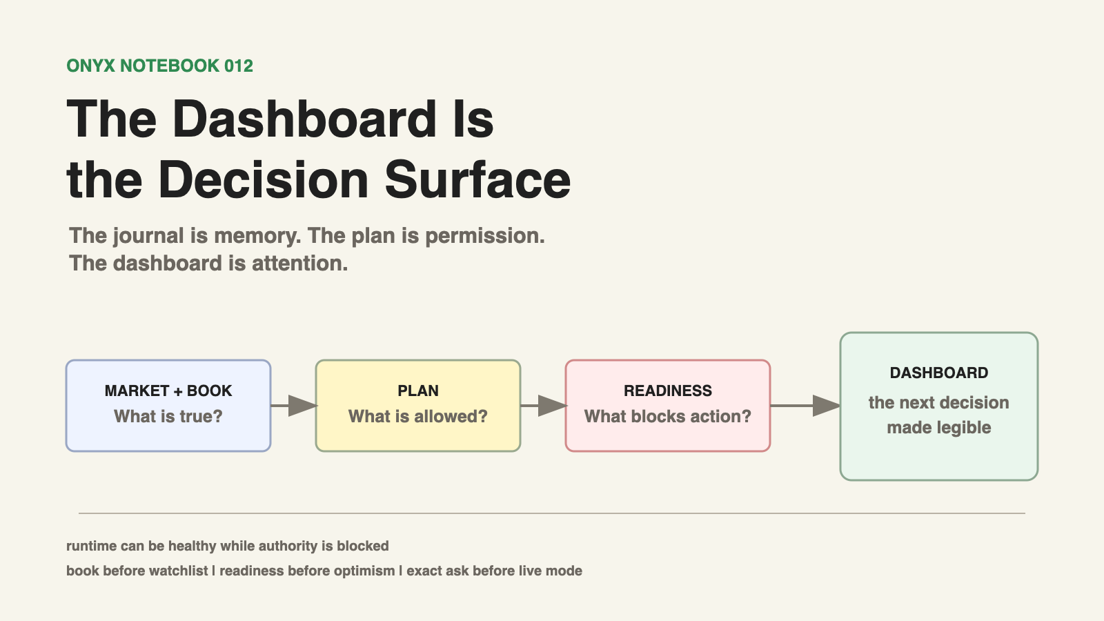
For a trading system, the question is rarely "what is happening?" by itself. That is only the first layer. The better question is what the current state allows us to do next. That is the dashboard lesson from the latest Onyx work. We did not just need a cleaner interface. We needed a decision surface.
This is not financial advice. This is a notebook about building a trading process in public, with trading infrastructure, code-enforced guardrails, and a journal that is slowly becoming part of the system itself.
A Dashboard Is Not Decoration
Trading dashboards are easy to overbuild in the wrong direction. More panels, more rows, more colors, more live numbers, more market context, more little signals that make the screen feel like a cockpit. Some of that matters. A live desk needs to know whether the data feed is alive, whether the trader is running, whether positions exist, whether orders are open, whether the market is strong or weak, and whether the system is stale. Hiding that information would be reckless.
But displaying information is not the same thing as supporting a decision. If the dashboard shows twenty true things but does not tell the desk which one matters first, the operator still has to reconstruct the process mentally under pressure. That is where mistakes creep in. Not because the system is blind, but because it is unfocused.
The newest version of the Onyx dashboard is trying to solve that problem. Its job is not to be the most complete possible picture of the market. Its job is to compress the live operating model into the next few decisions: whether the authority state is clean, whether the plan is current, whether the existing book is covered, whether action alerts exist, whether the market backdrop is supportive or fragile, and whether the system is ready for approval or blocked. Those questions have an order. The dashboard should respect that order.
Authority Comes First
The first thing the dashboard has to make obvious is whether Onyx is allowed to trade.
That sounds simple until you separate runtime from authority.
The runtime can be healthy while fresh entries are disabled. The feed can be live while the plan is stale. The trader can be running while the system is only allowed to manage existing positions. A button that says "running" is not the same thing as permission to open risk.
That is why the top of the dashboard now treats authority as its own surface.
PLAN means the current approved plan may open fresh entries, if all gates pass. TARGETS means existing positions can be managed with above-entry exits, but fresh buys are blocked. OBSERVE means the desk watches, records, and reviews, but submits no orders. REVIEW means the plan or market state needs human attention before execution. HALT means stop the machine from submitting orders. Those are not just UI labels. They are operating states.
This matters because one of the easiest ways to fool yourself is to confuse "the app is running" with "the desk is live." Onyx is designed to stay awake without always being allowed to take new risk. That distinction protects the process. The dashboard has to make it impossible to miss.
The Book Comes Before The Watchlist
The second question is not "what can we buy?"
The second question is "what do we already own?"
This is especially true under the no-loss rule. If Onyx will not automatically sell below average entry, then existing positions are not background clutter. They are live commitments. They consume capital, attention, and risk capacity until they are resolved.
That is why the dashboard now treats recovery and target management as first-class surfaces.
A watchlist can be exciting. A fresh setup can look clean. A market banner can say the tape is constructive. None of that matters if the existing book is uncovered, mismatched, or sitting below entry without a valid above-entry target plan.
The Plan vs Actual view exists for that reason.
It compares three things that are easy to think about separately and dangerous to ignore together: the plan, the broker book, and the open orders. If a position exists without a matching plan or recovery row, that is not just trivia. It is a desk exception. If a held position is missing an above-entry target order, that is not just a display issue. It is a readiness blocker. If a symbol is planned but has not triggered, that is not a failure. It is a waiting state.
The dashboard should make those distinctions visible without asking the operator to read the entire journal.
That is the shape we want: plan, book, and broker truth on the same surface.
Readiness Beats Optimism
The third layer is readiness.
Every trader knows the feeling of wanting the system to be ready because the market is moving. The tape is green. A name is reclaiming VWAP. The first hour is starting to matter. The operator wants the answer to be yes.
That is exactly when readiness needs to be boring.
The premarket readiness panel exists to slow the desk down in the right places. It checks the plan date. It checks the macro calendar. It checks the SPY and QQQ read. It checks the book snapshot. It checks sell-order safety. It checks target coverage. It checks the feed. It checks desk alerts.
None of those checks is glamorous. All of them are load-bearing.
The point is not to prevent trading. The point is to prevent the wrong kind of confidence.
A market can be bullish while the active plan is stale. A trader can be running while target coverage is missing. A feed can be live while the current plan still needs approval. A watchlist can be clean while the open book deserves attention first.
Readiness turns those facts into a decision state. READY, CAUTION, or BLOCKED is not a market opinion. It is an operational opinion. It tells the desk whether the system is clean enough to ask for live authority.
That is different from optimism. Optimism says the setup looks good. Readiness says the desk is allowed to act.
Alerts Should Name The Mismatch
The best alerts are not loud. They are specific.
A bad alert says something is wrong. A useful alert says what changed, why it matters, and what the next decision should be.
That is the reason Plan vs Actual mismatches now become desk alerts. If the dashboard sees that held positions are missing target coverage, it should not bury that fact in a table. It should promote it to the top of the desk.
The alert is not there to cause panic. It is there to prevent false calm.
Under the no-loss rule, missing target coverage is not a minor bookkeeping issue. It means the book is not covered the way the operating model expects. The system may still be safe in the sense that it is not selling below entry. But the desk is not ready in the sense that existing positions are actively managed.
That distinction matters.
Good alerts do not replace judgment. They route attention. They say: look here first.
The Market Banner Is Context, Not Permission
The market banner is intentionally simple: SPY, QQQ, and market quality. That is enough for the first glance.
The mistake would be treating a green banner as a green light. We already learned that lesson. A bullish read describes the tape. It does not approve the trade. A fragile-risk-on read may support selective entries. It may also argue for target management only if the book is heavy, volatility is firm, semiconductors are weak, or macro risk is unresolved.
The dashboard should tell us what the market is doing, but the plan still decides what the desk may do about it.
That is the balance. The banner gives context. The readiness panel checks the operating state. The plan grants permission. The trader executes only inside that permission.
The Dashboard Compresses The Desk
The journal can be long because the journal is where the reasoning lives. The plan can be precise because the plan is where permission lives. The dashboard has a different job. The dashboard is attention.
It should not carry every argument, every caveat, every news item, every chart read, and every path the desk considered. That belongs in the journal. We learned that already. A live dashboard that turns into a journal becomes too slow to use when the market is moving.
But the dashboard also cannot be shallow. It cannot be a handful of colorful numbers and a vibe. It has to show the compressed result of the process.
Not the whole essay. The current decision.
That is why the newer dashboard surfaces are organized around workflow instead of just data: desk focus, premarket readiness, Plan vs Actual, recovery and targets, needs approval, journal actions, market context, watchlist, events, news, and system state.
The ordering matters.
The dashboard is no longer asking what it can show. It is asking what the desk needs to decide next.
The Exact Ask Matters
One of the most useful parts of the process is forcing exact approval language.
Not "looks good." Not "go live if it makes sense." Not "watch it." An exact decision.
Approve target management only? Approve the current plan live? Keep fresh entries disabled while missing targets are reconciled? Review the plan because the market changed?
That language is uncomfortable in a good way. It removes the soft middle where vague agreement can later be mistaken for trading authority. It also keeps the desk honest about what is being approved. A person can approve target management without approving fresh buys. A person can approve a plan after target coverage is fixed. A person can say the market looks bullish and still refuse live authority.
Those are different decisions.
The dashboard should not blur them.
What Changed
The latest dashboard work did not change the philosophy of Onyx. It made the philosophy more visible.
Runtime and authority are separate. The current book comes before fresh ideas. No-loss exits require above-entry target discipline. Market context informs the plan but does not override it. Action alerts should point to mismatches, not decorate the screen. Readiness should be explicit before live approval. The journal should hold the reasoning. The plan should hold permission. The dashboard should hold attention.
That is the operating stack.
It sounds simple when written down. It took building and using the system to feel why it mattered.
The Lesson
The dashboard is not the strategy. The dashboard is not the journal. The dashboard is not the trader. It is the decision surface.
Its job is to make the next move legible. If the book is uncovered, show that first. If the plan is stale, say so. If the market is strong but authority is missing, separate those facts. If a row is waiting, call it waiting. If a position is in recovery, call it recovery. If approval is required, ask the exact question.
A good dashboard does not make the desk feel busy.
It makes the desk harder to fool.
That is the point.
The journal is memory. The plan is permission. The dashboard is attention.